Before we begin, I need to say a few things. Any brides who are honestly considering this, don't let this be a burden!!! The whole point of this is to work on a budget and NOT stress about Save-the-Dates. Even if you're NOT a bride, photoshop is incredibly intimidating and let me tell you a secret: I first learned photoshop by following a tutorial. YES people, I do it part-time professionally and I only learned it a year ago by following a tutorial. I was SO scared of photoshop that following a tutorial helped me to get "my feet in the water" by actually having an end goal. If you're a beginner, give yourself at least 45 minutes for this first part of the tutorial. If you're experienced or advanced, you can probably scroll through this and get the first part done in 5-10 minutes.
You can use this SAME tutorial or use it as an inspiration for your own invite to a wedding, baby shower, or birthday party. Or just to make pretty stuff! I'm going to share some photoshop tips.
First tip: USE YOUR RESOURCES! You can use FREE photoshop brushes the way you can use free fonts. The place I go to for my brushes is Deviant Art. Remember that a majority of these brushes are for NON-commercial work (meaning you can't sell or make money from the product that you used these brushes with). BUT if you do want to make $, you can contact the individual artists and get a license.
Step 1)
Download the following brushes & font:
Swirls by IvyPhotography
Birds by Falln-brushes
Lace by ashzstock
Font for names (cursive)
Font for date (western look)
A HUGE thank you to these DeviantArt artists for creating these materials to help us designers & brides out!
So have you downloaded your brushes? Remember to click "Extract All Files" after they are downloaded. After you extract them, double click the icon and it will open automatically in photoshop.
TIME FOR PHOTOSHOP!!!
Since I took screenshots of this, my suggestion is to CLICK ON THE IMAGE to see a bigger view of my computer screen. Then click back to read the instructions.
Step 2)
Create a new document by going to File > New. On the "preset" drop down box, select photo.
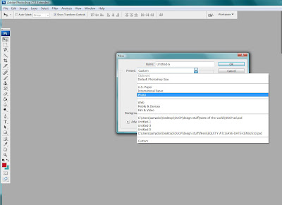
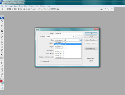
After selecting photo, under the size drop-down box, select Landscape 4x6 > OK
Your nice white canvas should pop up, but before we get started on designing it, go to Image > Rotate Canvas > 90 (degrees) CW (or skip the rotate canvas by selecting Portrait 4x6 in the beginning :)
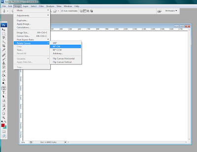
-- The reason I am making this as a photo canvas is so that you have the option to save your final invite as a JPG (i.e. photo) and get it printed as a postcard or even at CVS as a photo!
Step 3)
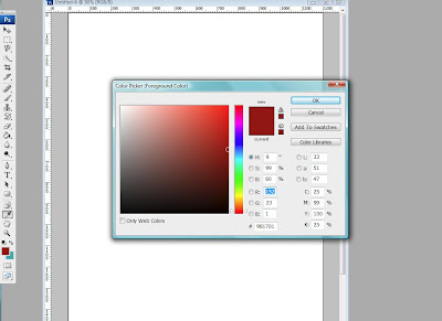
Design! Select your color by going to the little colored boxes on your far bottom left. You can see how mine are already red & teal but typically your photoshop default is black & white. Click on the image to read the # on the color-box to see the exact shade of red I used.
Next you are going to create a NEW layer by simply going to the VERY bottom right hand side of your screen where you see tiny icons in the shape of a trash can, a square, a file folder, etc. Click on the square that has a little square inside of it.
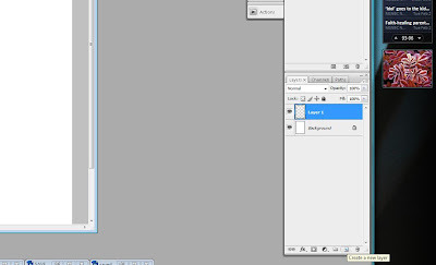
For photoshop beginners: In everything that you do, you always want to "draw" or "design" on a NEW layer. This allows you to erase specific parts of your image. For example: if you opened up a photo in photoshop, created a NEW layer, and drew a silly mustache on the face of the guy in the photo but you accidentally made it in white. You can erase JUST the mustache that you drew on your NEW layer and re-draw it. BUT, if you would have drawn the mustache on the PHOTO (without creating a new layer), then when you tried to erase it, you would erase THE PHOTO too! Make sense? Think back on middle school and lamination sheets. Yup, the old school way of doing math & grammar when the teacher would use her red lamination marker on the projector sheets. THOSE are layers.
Ok... back to the design.
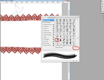
Now we have our color and layer. Select your brush icon on your far left toolbar (refer to image). Then go to your brush selection by clicking on the tab labeled "brushes" on your right. This will pop out a list of brushes you currently have. Select your lace brush (mine was number 2413). Shift the size of your brush by moving the slider at the bottom of the brush box until it is at 1269 OR you can just type in that number in the box.
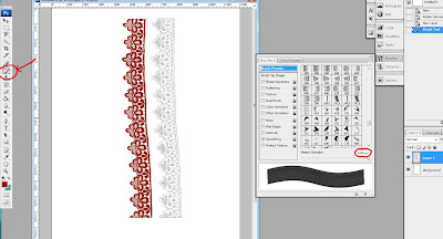
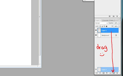
Next you will copy (or duplicate) that layer by dragging your layer to the layer icon at the bottom (remember to hold it down and drag).
Now you can rename your layers by clicking on the WORDS of your layer (Layer 1). This should allow you to rename your layer similar to renaming photos on your desktop. I called them "bottom lace" and "top lace." Then rotate your lace so that the top one has the edges waving up and the bottom one facing down. You rotate them by clicking on the arrow button at the very TOP left of your toolbar.
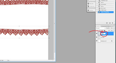
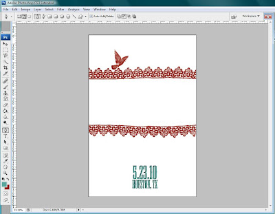
Now make a new layer, click on your brush tool again, and select the bird brush (mine is numbered 215) at size 243 px. Stamp the bird on the 4th lace piece at the top like so:
Step 4)
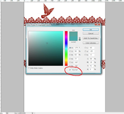
Time for the font! Click on your colored box again (on the far left bottom), and a box should pop up. If you want the same teal I used, the number is 4da7a0. Then select your Mesquite STD font and type the city + state of your wedding. Then in a separate text box, type the date numerically.
I used size size 30 (smaller) for the location, and 48 pt for the date.
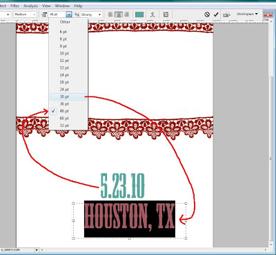
You can see on the next image how I have 2 text boxes: one for the date and one for the location. Double click one of the text layers (but make sure you double click the right side) and a box should pop up like so:
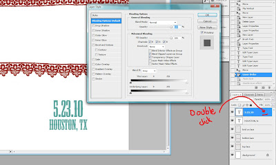
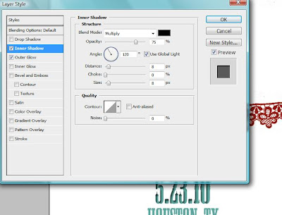
This is where I'm going to make your text look good! First, check the box "Inner Shadow" and make the following changes under this category (make sure the "inner shadow" box is HIGHLIGHTED so you're working on it): change blend mode to multiply, opacity at 75%, angle = 120, distance = 8, choke = 0, and size = 8. Refer to image:
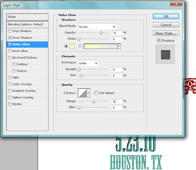
Last, check your outer glow box and make the following changes: blend mode = screen, opacity = 75%, size = 8, and range = 50. Like so:
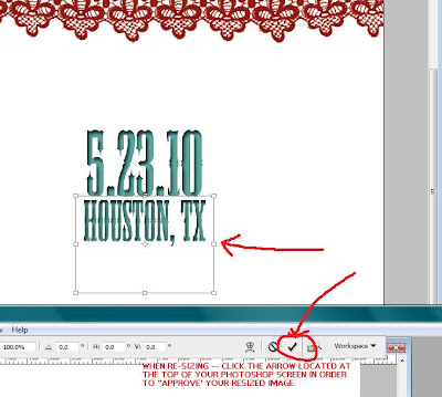
Now hit OK! Repeat with your other text. Let's make the location font the same width as the date. Select the arrow on your far TOP left of your toolbar (make sure your LOCATION layer is selected!). After you click on the arrow, a box should appear around your text. Reduce the size by using your mouse and squeezing the letters together. You can even make it a little taller, but make sure the width is the same as your date! Then click the arrow at the very TOP of your screen (towards the right) and it will save your re-sizing. Don't mind my photo, I ended up cropping it at the bottom (my bad).
So now you should have THIS!
We'll cover the rest tomorrow or Friday. If you have any questions -- ask away in the comments! Especially for photoshop beginners -- I know this can be a bit nerve wracking. Don't let it be. Play around with brushes, try searching for more brushes on DeviantArt, and play around. Let this tutorial teach you how to save it as a JPEG (photo) so you can get them printed for cheap.


0 comments:
Post a Comment